Hollywoodland Movers Branding
The new moving company Hollywoodland Movers got in touch with me about coming up with a brand and website. They wanted something evocative of old hollywood and the entertainment industry that helped build the beautiful LA area at the turn of the century.
Michael was starting out on his own after two decades of working for a moving company and wanted the chance to build one that was truly his, and reflected his love of both movies and the city of LA. He showed me some photography of 1920s-1930s LA, including the original “hollywoodland” sign before it was shortened in the renovations.
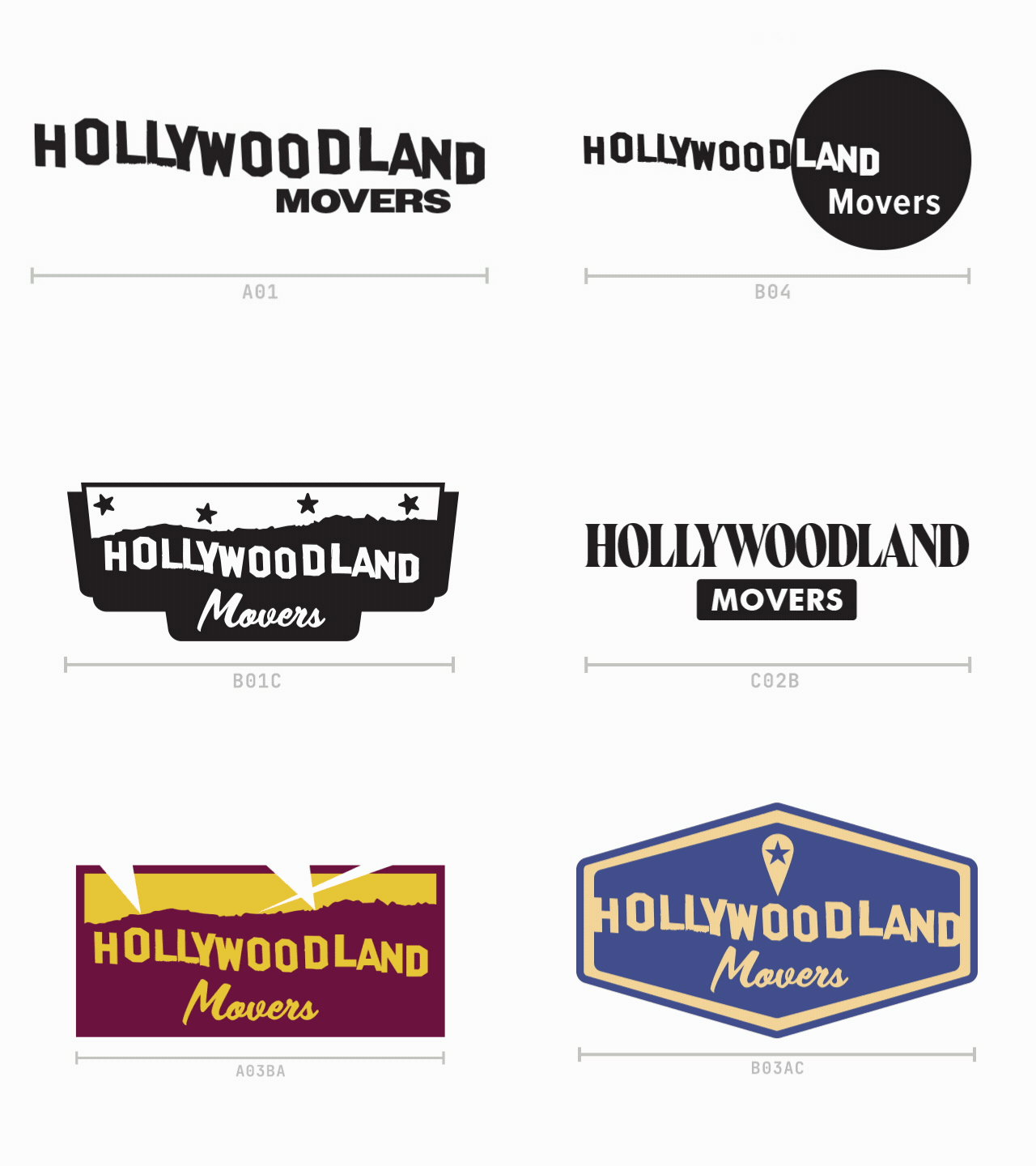
The logo design went through many iterations — the primary roadblock was the unruly nature of the hollywood hill silhouette throwing off a lot of the balance, and the very wide and short nature of a word as long as “hollywoodland” that could not be separated and stacked without destroying the iconic sign visual.
The final logo suite was three options — a main badge-style and two alternate circle and retro hexagon styles for use in merch.
The client originally wanted to go for a black and white style to connect it to old hollywood photography, but we eventually settled on a black and beige look to imply the gold of film awards and the prestige of the golden age of hollywood.
Once this was all settled on, we were able to move on to creating a wrap for the fleet of moving trucks, as well as collateral and a website built in wordpress, with a contact form integration connecting to a third-party CRM.


